Continuing on from part one we can ask the question, why do we visualise?
Essentially, we visualise to gain an insight and understanding to complex issues.
The lecture discussed a book by Alberto Cairo, which is called ‘The Functional Art’. Cairo talks about reading an article about the worlds population and the conflicting ideas about the fertility rate. This articles author discussed that on average, fertility in rich countries is very low but in the last few years has trended slightly upwards, however on the other hand, poor countries are beginning to show a decrease in average fertility. Therefore, the author suggests that because of these two complimentary trends, fertility rates everywhere will converge around 2.1 in a few decades and the worlds population will stabilize at 9 billion people.
(Cmielewski, 2016)
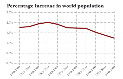
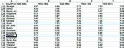
This discussion is supported by this graphic seen above, which shows how much world population increases compared to the previous year. Despite this, the graphic impedes our ability to see the multiple patterns that the author discusses… Where are those rich countries? Where is the evidence that developing countries are stabilizing their populations? Due to this, Cairo went to the United Nations website and downloaded data on fertility rate, children per women where he challenged himself to discover interesting patterns through a spreadsheet program, like the one seen below.
(Cairo, 2013).
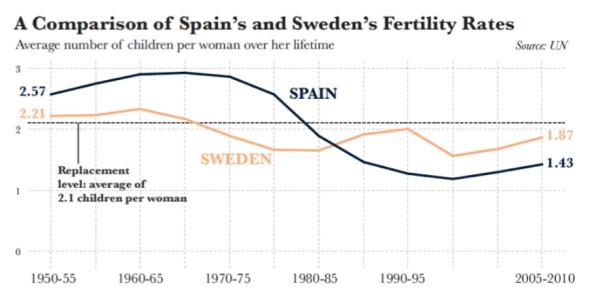
If we look closer, we can see that Spain started at 1950 with an average number of children per women higher than Sweden’s, but then fertility in Spain fell drastically after 1979 and only recovered partially in the last five years. We can also see that Sweden’s fertility rate has remained stable in the last sixty years besides the drop in the 70s.
(Cairo, 2013).
By visually encoding numbers saves a visual designer the time it takes to analyse numbers from a table, the graph creates an easier alternative to discover trends such as the comparison of Spain and Sweden’s fertility rates above.
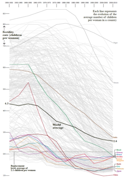
Here is what happens if you highlight some rich countries and a few developing countries into a graph. In this case the author argued that the drop in fertility rates could be from a range of factors such as, women getting better access to education. This allows us to see the evidence supporting the authors discussion on the evolution of fertility.
(Cairo, 2013).
Furthermore, from looking at the images of part one and two, we can see that of the more contemporary examples (as just explained) is that the amount of information presented now, is far greater than the earlier examples. Thus, does that mean today we have a more graphically sophisticated audience? Maybe.
Reflection
I found this part of the lecture really interesting because it focused on a complex issue that involved a large amount of data. It encouraged productive ways to manage this amount of data, such as, downloading the information into a spreadsheet and looking closely at areas to discover patterns and develop trends before turning the information into a sophisticated, coherent graph. It expressed that one of the key requirements for visualisation is that readers should be given enough information to enable them to either follow a presented argument or use their own intelligence to extract their own meaning.
References
Cairo, A. (2013). The functional art: An introduction to information graphics and visualisation. (1st ed.). Berkeley, CA: New Riders
Cmielewski, L. (Speaker). 2016. Lecture Pod 03: Historical & Contemporary Visualisation Part 2 [Vimeo video]. Western Sydney University.
